You only have 8 seconds to attract and convince a potential customer to buy your product. In order to win that battle for attention, you need a packaging solution that will stand out.
Wearing my professor’s hat today, I will give you some tips about attractive packaging. You will learn how to create or improve packaging solutions to catch the attention of the customers. So let’s get started!
How can I make my packaging more attractive?
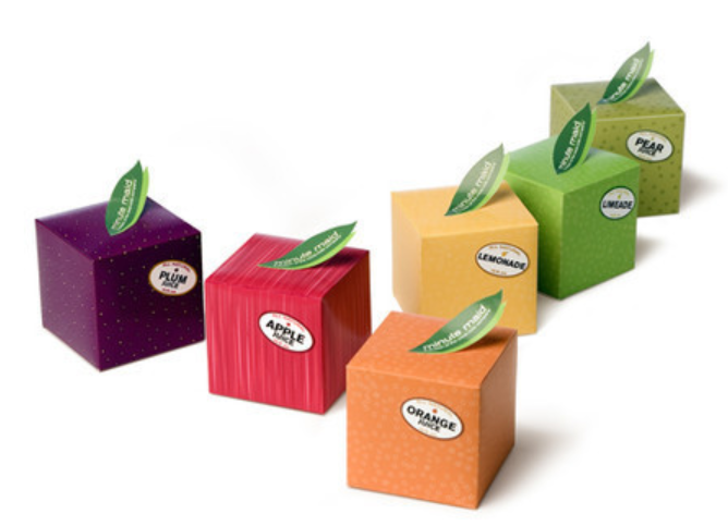
Thinking about your brand image and user’s feature, the goal is to work out one packaging solution that can interact with customers’ hearts and behaviors and also make users feel worthwhile. Here we focus on explaining attractive packaging solutions from elements such as colors, materials, fonts, and shapes.
There are lots of tricks that experts in the packaging industry use, in order to build attractive packaging. Don’t worry, I will tell you all those secrets right now! By the end of the article you will have enough information to take your packaging to the next level. Don’t forget to take notes and enjoy the lecture!
How should I choose the characteristics of my packaging?
Combining colors, textures, shapes and fonts into a perfect packaging solution can sound difficult at first. But, by focusing on one part at a time, everything will be simple and natural.
This is exactly, how we are going to do it today. We’ll analyze each part that you could improve for better packaging, and in the end we will look at the whole picture. Now, let us start with…

Colors
Packaging’s color is the first element that attracts attention, but choosing the right one will help your business more than you think.
If your product will be displayed on shelves, it needs to stand out from the rest of your competitors. Red, pink, yellow and green have been proved to be the best colors to use when you want to get noticed. But does that mean that every business will design their packaging using only 4 colors? Of course not. Here are some tips that may help you!
- Analyze how your competitor’s packaging looks like, and try to build yours using different colors. This way, you will have an advantage when fighting for the attention of a passer-by.
- Utilize the psychology of colors, which says that each color will make people feel in a certain way. For instance, blue is often associated with trust and technology. Another example is red which suggests love, affection, romance or dynamism. You should use the color that helps you deliver the initial message you decided on!
- Match the colors of your packaging with your brand’s main colors. This will help you build a strong brand image in the future.
Material
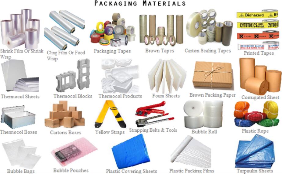
The tactile sensation should be one of your top priorities too! It has been shown that a pleasant material will create the feeling of psychological ownership. This will heavily influence the potential customer into buying the product.
If the other elements of the packaging are perfectly chosen, a customer will pick-up the packaging and will inevitably hold it in his hands. This is the moment when choosing the right material will help you! You want them attracted to the feeling of holding it. Because of how our brains work, they will develop an unconscious relationship with the product.
You can choose a matte finish, a glossy one, a premium thick glass or a rough surface. Anything that will help you communicate the initial message.
Keep in mind who your ideal customer is and what would he like to feel when touching the product!
Fonts
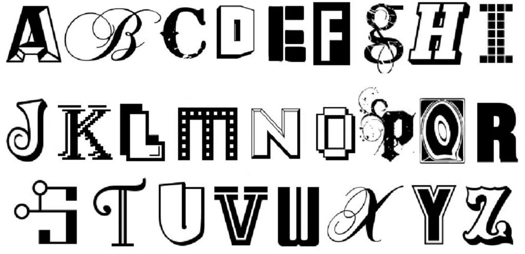
Choosing fonts randomly is one of the biggest mistakes business owners make. Yes, the information will be the same, but the message will be different.
First of all, you want a readable font. Before thinking of how it looks and what you want it to express, you need to make sure people can actually read it, without any bit of effort. Then, you need to understand what message does each font family deliver.
If you want to express luxury and elegance, you should go for a handwritten font (e.g. Massimo Dutti). On the other hand, if your brand is a modern one, related to technology, you could choose a font from the Sans-Serif family (e.g. Google).
There are hundreds of fonts you can choose from, but make sure the one you select is suitable for your brand and its message!
Shape

The shape is probably the best differentiating element that you can choose. The truth is people are bored of classic packaging. There are several studies showing how people are attracted by curved shapes, more than they are attracted to rectilinear ones.
This is your chance to be special, by choosing a unique shape for your packaging, that no other brand has. It should be representative for your product and brand too!
For example, imagine you sell hand cream, you could design your packaging as a hand. This way, people will be attracted to it and determined to pick it up from the shelf. Because their first thought would be “How cool is that?”, you will be remembered.
It will also have an impact on the long term too! Mouth-to-mouth advertising will happen. People will show their friends their new acquisition or tell them about what they found in the supermarket. Free advertising is the best!
What other things should I consider, if I want people attracted to my packaging?
Well, there are some little things that also matter. If you want a close-to-perfection solution, you need to consider them too!
Practicality
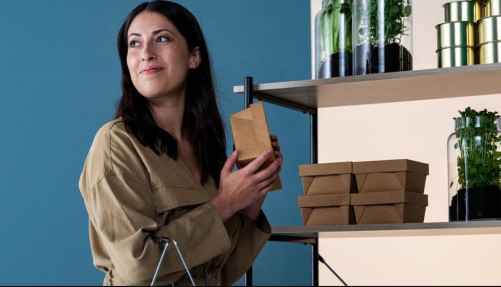
How good is a packaging solution that is not practical? Not that good.
If the interaction with the packaging happens every time the consumer uses the product, a good experience will be very important. Make him enjoy that interaction, and chances are he will buy the product again – and this is what you want!
It is much cheaper to make someone rebuy your product, than it is to determine someone to buy it for the first time. So, you need to deliver great experiences for your recurring clients.
A cause or movement they support
For this one, you need to know your audience very well.
People are easily influenced into buying something, if they find a brand that supports causes they care about.
Someone being extremely passionate about protecting the environment would be interested in brands that use eco-friendly packaging. On the other hand, if they care about children in Africa, you could add a sincere statement about your brand helping those children.
Identify what causes are important to most of your audience, and design your packaging having those in mind.

Conclusion
No matter how many things you should consider when designing your packaging solution. Combining them really is an art that requires constant practice and improvement. Therefore, you should not do it by yourself! You can easily hire a professional that will be your adviser and your implementer too. You can choose to work with a packaging broker.
When do yourself, always keep in mind who you design your packaging for and try to think like them. Like a saying “Putting yourself in their shoes will help you create the most attractive packaging ever!”


